
 Responsive Web Design - Introduction
What is Responsive Web Design?
Responsive web design makes your web page look good on all devices.Responsive web design uses only HTML and CSS.
Responsive web design is not a program or a JavaScript.
Designing For The Best Experience For All Users
Web pages can be viewed using many different devices: desktops, tablets, and phones. Your web page should look good, and be easy to use, regardless of the device.Web pages should not leave out information to fit smaller devices, but rather adapt its content to fit any device:
Desktop

Tablet

Phone
Responsive Web Design - The Viewport
What is The Viewport?
The viewport is the user's visible area of a web page.The viewport varies with the device, and will be smaller on a mobile phone than on a computer screen.
Before tablets and mobile phones, web pages were designed only for computer screens, and it was common for web pages to have a static design and a fixed size.
Then, when we started surfing the internet using tablets and mobile phones, fixed size web pages were too large to fit the viewport. To fix this, browsers on those devices scaled down the entire web page to fit the screen.
This was not perfect!! But a quick fix.
Setting The Viewport
HTML5 introduced a method to let web designers take control over the viewport, through the<meta> tag.You should include the following
<meta> viewport element in all your web pages:<meta name="viewport" content="width=device-width, initial-scale=1.0">A <meta> viewport element gives the browser instructions on how to control the page's dimensions and scaling.The
width=device-width part sets the width of the page to follow the screen-width of the device (which will vary depending on the device).The
initial-scale=1.0 part sets the initial zoom level when the page is first loaded by the browser.Here is an example of a web page without the viewport meta tag, and the same web page with the viewport meta tag:
Tip: If you are browsing this page with a phone or a tablet, you can click on the two links below to see the difference.
Size Content to The Viewport
Users are used to scroll websites vertically on both desktop and mobile devices - but not horizontally!So, if the user is forced to scroll horizontally, or zoom out, to see the whole web page it results in a poor user experience.
Some additional rules to follow:
1. Do NOT use large fixed width elements - For example, if an image is displayed at a width wider than the viewport it can cause the viewport to scroll horizontally. Remember to adjust this content to fit within the width of the viewport.
2. Do NOT let the content rely on a particular viewport width to render well - Since screen dimensions and width in CSS pixels vary widely between devices, content should not rely on a particular viewport width to render well.
3. Use CSS media queries to apply different styling for small and large screens - Setting large absolute CSS widths for page elements will cause the element to be too wide for the viewport on a smaller device. Instead, consider using relative width values, such as width: 100%. Also, be careful of using large absolute positioning values. It may cause the element to fall outside the viewport on small devices.
Responsive Web Design - Grid-View
What is a Grid-View?
Many web pages are based on a grid-view, which means that the page is divided into columns:Using a grid-view is very helpful when designing web pages. It makes it easier to place elements on the page.
A responsive grid-view often has 12 columns, and has a total width of 100%, and will shrink and expand as you resize the browser window.
Building a Responsive Grid-View
Lets start building a responsive grid-view.First ensure that all HTML elements have the
box-sizing property set to border-box. This makes sure that the padding and border are included in the total width and height of the elements.Add the following code in your CSS:
* {
box-sizing: border-box;}box-sizing property in our CSS3 Box Sizing chapter.The following example shows a simple responsive web page, with two columns:
25%
75%
Example
.menu {
width: 25%;
float: left;}
.main {
width: 75%;
float: left;}
However, we want to use a responsive grid-view with 12 columns, to have more control over the web page.
First we must calculate the percentage for one column: 100% / 12 columns = 8.33%.
Then we make one class for each of the 12 columns,
class="col-" and a number defining how many columns the section should span:CSS:
.col-1 {width: 8.33%;}
.col-2 {width: 16.66%;}
.col-3 {width: 25%;}
.col-4 {width: 33.33%;}
.col-5 {width: 41.66%;}
.col-6 {width: 50%;}
.col-7 {width: 58.33%;}
.col-8 {width: 66.66%;}
.col-9 {width: 75%;}
.col-10 {width: 83.33%;}
.col-11 {width: 91.66%;}
.col-12 {width: 100%;} CSS:
[class*="col-"] {
float: left;
padding: 15px;
border: 1px solid red;} <div>. The number of columns inside a row should always add up to 12:HTML:
<div class="row">
<div class="col-3">...</div> <!-- 25% -->
<div class="col-9">...</div> <!-- 75% -->
</div> CSS:
.row::after {
content: "";
clear: both;
display: table;} Example
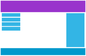
html {
font-family: "Lucida Sans", sans-serif;}
.header {
background-color: #9933cc;
color: #ffffff;
padding: 15px;}
.menu ul {
list-style-type: none;
margin: 0;
padding: 0;}
.menu li {
padding: 8px;
margin-bottom: 7px;
background-color :#33b5e5;
color: #ffffff;
box-shadow: 0 1px 3px rgba(0,0,0,0.12), 0 1px 2px rgba(0,0,0,0.24);}
.menu li:hover {
background-color: #0099cc;} Notice that the webpage in the example does not look good when you resize the browser window to a very small width. In the next chapter you will learn how to fix that.
It uses the
Media queries can help with that. We can add a breakpoint where certain parts of the design will behave differently on each side of the breakpoint.
Desktop
Phone
Use a media query to add a breakpoint at 768px:
Responsive Web Design - Media Queries
What is a Media Query?
Media query is a CSS technique introduced in CSS3.It uses the
@media rule to include a block of CSS properties only if a certain condition is true.Example
If the browser window is smaller than 500px, the background color will change to lightblue:@media only screen and (max-width: 500px) {
body {
background-color: lightblue;
}}
Add a Breakpoint
Earlier in this tutorial we made a web page with rows and columns, and it was responsive, but it did not look good on a small screen.Media queries can help with that. We can add a breakpoint where certain parts of the design will behave differently on each side of the breakpoint.
Desktop
Phone
Use a media query to add a breakpoint at 768px:
Example
When the screen (browser window) gets smaller than 768px, each column should have a width of 100%:/* For desktop: */
.col-1 {width: 8.33%;}
.col-2 {width: 16.66%;}
.col-3 {width: 25%;}
.col-4 {width: 33.33%;}
.col-5 {width: 41.66%;}
.col-6 {width: 50%;}
.col-7 {width: 58.33%;}
.col-8 {width: 66.66%;}
.col-9 {width: 75%;}
.col-10 {width: 83.33%;}
.col-11 {width: 91.66%;}
.col-12 {width: 100%;}
@media only screen and (max-width: 768px) {
/* For mobile phones: */
[class*="col-"] {
width: 100%;
}}Always Design for Mobile First
Mobile First means designing for mobile before designing for desktop or any other device (This will make the page display faster on smaller devices).This means that we must make some changes in our CSS.
Instead of changing styles when the width gets smaller than 768px, we should change the design when the width gets larger than 768px. This will make our design Mobile First:
Example
/* For mobile phones: */
[class*="col-"] {
width: 100%;}
@media only screen and (min-width: 768px) {
/* For desktop: */
.col-1 {width: 8.33%;}
.col-2 {width: 16.66%;}
.col-3 {width: 25%;}
.col-4 {width: 33.33%;}
.col-5 {width: 41.66%;}
.col-6 {width: 50%;}
.col-7 {width: 58.33%;}
.col-8 {width: 66.66%;}
.col-9 {width: 75%;}
.col-10 {width: 83.33%;}
.col-11 {width: 91.66%;}
.col-12 {width: 100%;}}
Another Breakpoint
You can add as many breakpoints as you like.We will also insert a breakpoint between tablets and mobile phones.
Desktop
Tablet
Phone
We do this by adding one more media query (at 600px), and a set of new classes for devices larger than 600px (but smaller than 768px):
Example
Note that the two sets of classes are almost identical, the only difference is the name (col- and col-m-):/* For mobile phones: */
[class*="col-"] {
width: 100%;}
@media only screen and (min-width: 600px) {
/* For tablets: */
.col-m-1 {width: 8.33%;}
.col-m-2 {width: 16.66%;}
.col-m-3 {width: 25%;}
.col-m-4 {width: 33.33%;}
.col-m-5 {width: 41.66%;}
.col-m-6 {width: 50%;}
.col-m-7 {width: 58.33%;}
.col-m-8 {width: 66.66%;}
.col-m-9 {width: 75%;}
.col-m-10 {width: 83.33%;}
.col-m-11 {width: 91.66%;}
.col-m-12 {width: 100%;}}
@media only screen and (min-width: 768px) {
/* For desktop: */
.col-1 {width: 8.33%;}
.col-2 {width: 16.66%;}
.col-3 {width: 25%;}
.col-4 {width: 33.33%;}
.col-5 {width: 41.66%;}
.col-6 {width: 50%;}
.col-7 {width: 58.33%;}
.col-8 {width: 66.66%;}
.col-9 {width: 75%;}
.col-10 {width: 83.33%;}
.col-11 {width: 91.66%;}
.col-12 {width: 100%;}} HTML Example
For desktop:The first and the third section will both span 3 columns each. The middle section will span 6 columns.
For tablets:
The first section will span 3 columns, the second will span 9, and the third section will be displayed below the first two sections, and it will span 12 columns:
<div class="row">
<div class="col-3 col-m-3">...</div>
<div class="col-6 col-m-9">...</div>
<div class="col-3 col-m-12">...</div>
</div> Orientation: Portrait / Landscape
Media queries can also be used to change layout of a page depending on the orientation of the browser.You can have a set of CSS properties that will only apply when the browser window is wider than its height, a so called "Landscape" orientation:
Example
The web page will have a lightblue background if the orientation is in landscape mode:@media only screen and (orientation: landscape) {
body {
background-color: lightblue;
}} Responsive Web Design - Images
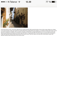
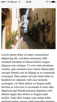
 Resize the browser window to see how the image scales to fit the page.
Using The width Property
If the width property is set to 100%, the image will be responsive and scale up and down:
Example
img {
width: 100%;
height: auto;} Notice that in the example above, the image can be scaled up to be larger than its original size. A better solution, in many cases, will be to use the max-width property instead.
Using The max-width Property
If the max-width property is set to 100%, the image will scale down if it has to, but never scale up to be larger than its original size:
Example
img {
max-width: 100%;
height: auto;}
Add an Image to The Example Web Page
Example
img {
width: 100%;
height: auto;}
Background Images
Background images can also respond to resizing and scaling.
Here we will show three different methods:
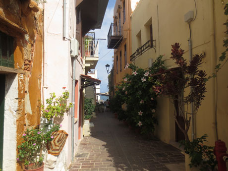
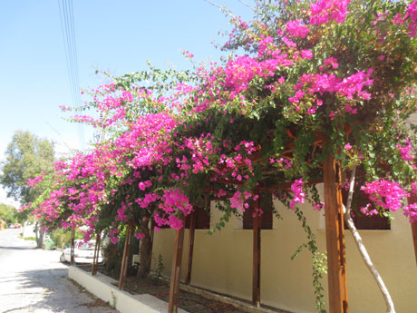
1. If the background-size property is set to "contain", the background image will scale, and try to fit the content area. However, the image will keep its aspect ratio (the proportional relationship between the image's width and height):
Here is the CSS code:
Example
div {
width: 100%;
height: 400px;
background-image: url('img_flowers.jpg');
background-repeat: no-repeat;
background-size: contain;
border: 1px solid red;}
2. If the background-size property is set to "100% 100%", the background image will stretch to cover the entire content area:
Here is the CSS code:
Example
div {
width: 100%;
height: 400px;
background-image: url('img_flowers.jpg');
background-size: 100% 100%;
border: 1px solid red;}
3. If the background-size property is set to "cover", the background image will scale to cover the entire content area. Notice that the "cover" value keeps the aspect ratio, and some part of the background image may be clipped:
Here is the CSS code:
Example
div {
width: 100%;
height: 400px;
background-image: url('img_flowers.jpg');
background-size: cover;
border: 1px solid red;}
Different Images for Different Devices
A large image can be perfect on a big computer screen, but useless on a small device. Why load a large image when you have to scale it down anyway? To reduce the load, or for any other reasons, you can use media queries to display different images on different devices.
Here is one large image and one smaller image that will be displayed on different devices:

Example
/* For width smaller than 400px: */
body {
background-image: url('img_smallflower.jpg'); }
/* For width 400px and larger: */
@media only screen and (min-width: 400px) {
body {
background-image: url('img_flowers.jpg');
}} You can use the media query min-device-width, instead of min-width, which checks the device width, instead of the browser width. Then the image will not change when you resize the browser window:
Example
/* For devices smaller than 400px: */
body {
background-image: url('img_smallflower.jpg'); }
/* For devices 400px and larger: */
@media only screen and (min-device-width: 400px) {
body {
background-image: url('img_flowers.jpg');
}}
HTML5 <picture> Element
HTML5 introduced the <picture> element, which lets you define more than one image.
Browser Support
Element
<picture> 13 38.0 38.0 9.1 25.0
The <picture> element works similar to the <video> and <audio> elements. You set up different sources, and the first source that fits the preferences is the one being used:
Example
<picture>
<source srcset="img_smallflower.jpg" media="(max-width: 400px)">
<source srcset="img_flowers.jpg">
<img src="img_flowers.jpg" alt="Flowers">
</picture> The srcset attribute is required, and defines the source of the image.
The media attribute is optional, and accepts the media queries you find in CSS @media rule.
You should also define an <img> element for browsers that do not support the <picture> element.
Responsive Web Design - Videos
Using The width Property
If the width property is set to 100%, the video player will be responsive and scale up and down:
Example
video {
width: 100%;
height: auto;} Notice that in the example above, the video player can be scaled up to be larger than its original size. A better solution, in many cases, will be to use the max-width property instead.
Using The max-width Property
If the max-width property is set to 100%, the video player will scale down if it has to, but never scale up to be larger than its original size:
Example
video {
max-width: 100%;
height: auto;}
Add a Video to the Example Web Page
We want to add a video in our example web page. The video will be resized to always take up all the available space:
Example
video {
width: 100%;
height: auto;}
Responsive Web Design - Frameworks
There are many existing CSS Frameworks that offer Responsive Design.They are free, and easy to use.
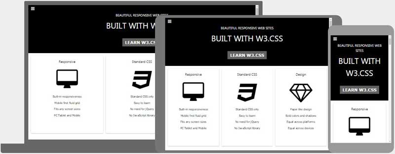
Using W3.CSS
A great way to create a responsive design, is to use a responsive style sheet, like W3.CSS
W3.CSS makes it easy to develop sites that look nice at any size; desktop, laptop, tablet, or phone:
W3.CSS Demo
Resize the page to see the responsiveness!London
London is the capital city of England.
It is the most populous city in the United Kingdom, with a metropolitan area of over 13 million inhabitants.Paris
Paris is the capital of France.
The Paris area is one of the largest population centers in Europe, with more than 12 million inhabitants.Tokyo
Tokyo is the capital of Japan.
It is the center of the Greater Tokyo Area, and the most populous metropolitan area in the world.Example
<!DOCTYPE html>
<html>
<meta name="viewport" content="width=device-width, initial-scale=1">
<link rel="stylesheet" href="https://www.w3schools.com/w3css/4/w3.css">
<body>
<div class="w3-container w3-green">
<h1>W3Schools Demo</h1>
<p>Resize this responsive page!</p>
</div>
<div class="w3-row-padding">
<div class="w3-third">
<h2>London</h2>
<p>London is the capital city of England.</p>
<p>It is the most populous city in the United Kingdom,
with a metropolitan area of over 13 million inhabitants.</p>
</div>
<div class="w3-third">
<h2>Paris</h2>
<p>Paris is the capital of France.</p>
<p>The Paris area is one of the largest population centers in Europe,
with more than 12 million inhabitants.</p>
</div>
<div class="w3-third">
<h2>Tokyo</h2>
<p>Tokyo is the capital of Japan.</p>
<p>It is the center of the Greater Tokyo Area,
and the most populous metropolitan area in the world.</p>
</div>
</div>
</body>
</html> To learn more about W3.CSS, read our W3.CSS Tutorial.
Bootstrap
Another popular framework is Bootstrap, it uses HTML, CSS and jQuery to make responsive web pages.
Example
<!DOCTYPE html>
<html lang="en">
<head>
<title>Bootstrap Example</title>
<meta charset="utf-8">
<meta name="viewport" content="width=device-width, initial-scale=1">
<link rel="stylesheet" href="https://maxcdn.bootstrapcdn.com/bootstrap/3.3.7/css/bootstrap.min.css">
<script src="https://ajax.googleapis.com/ajax/libs/jquery/3.2.0/jquery.min.js"></script>
<script src="https://maxcdn.bootstrapcdn.com/bootstrap/3.3.7/js/bootstrap.min.js"></script>
</head>
<body>
<div class="container">
<div class="jumbotron">
<h1>My First Bootstrap Page</h1>
</div>
<div class="row">
<div class="col-sm-4">
...
</div>
<div class="col-sm-4">
...
</div>
<div class="col-sm-4">
...
</div>
</div>
</div>
</body>
</html>
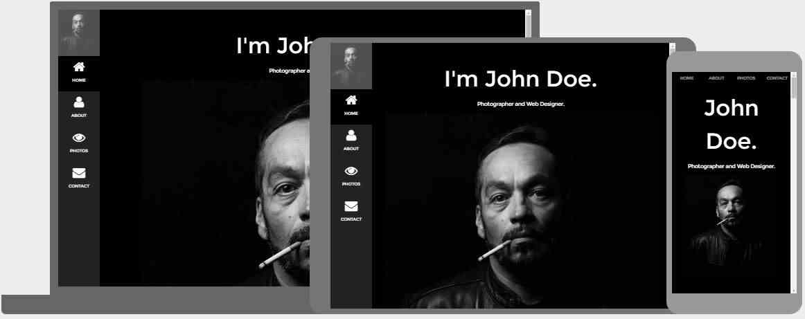
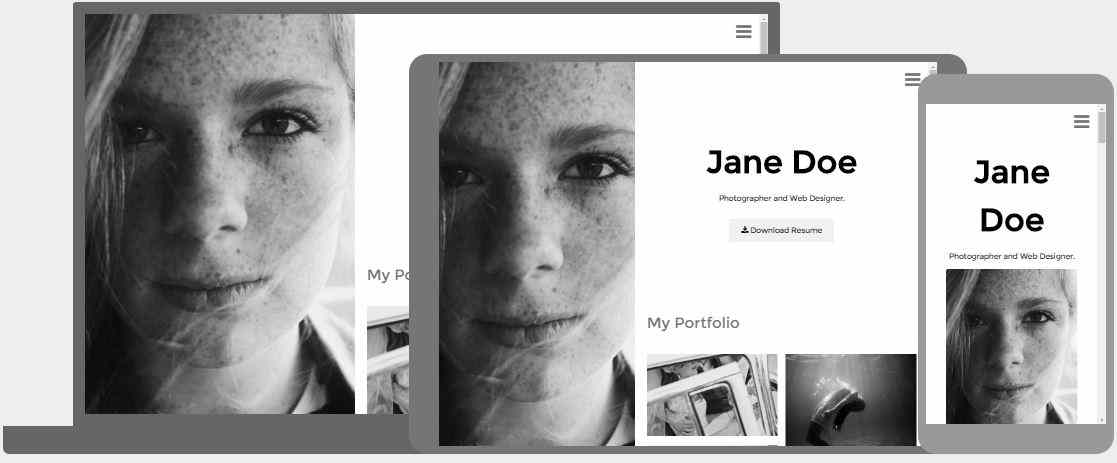
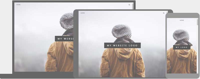
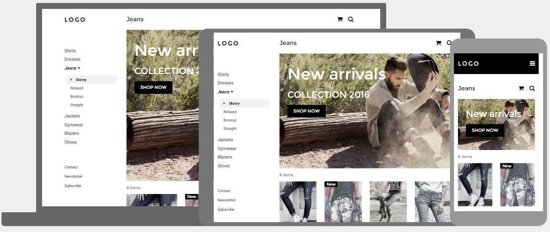
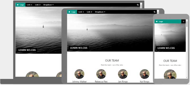
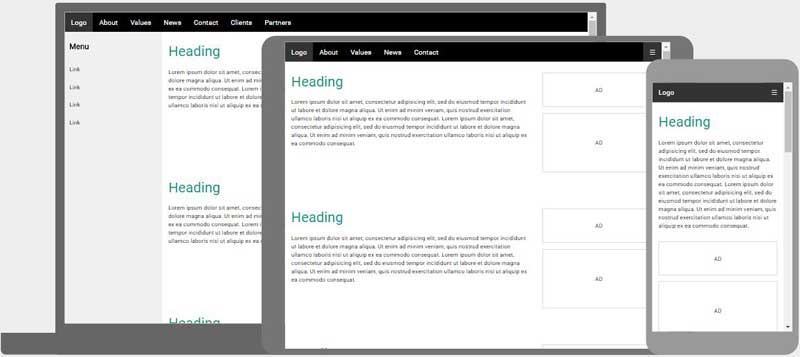
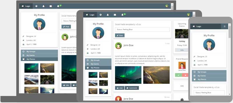
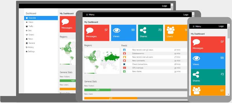
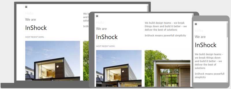
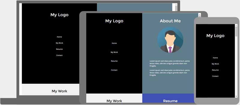
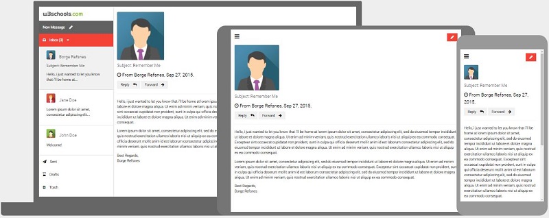
Responsive Web Design - Templates
W3.CSS Web Site Templates
We have created some responsive templates with W3.CSS.
You are free to modify, save, share, and use them in all your projects.
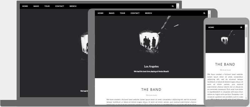
Band Template
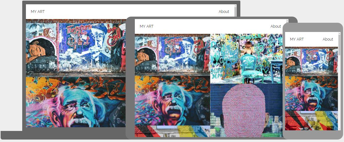
Art Template
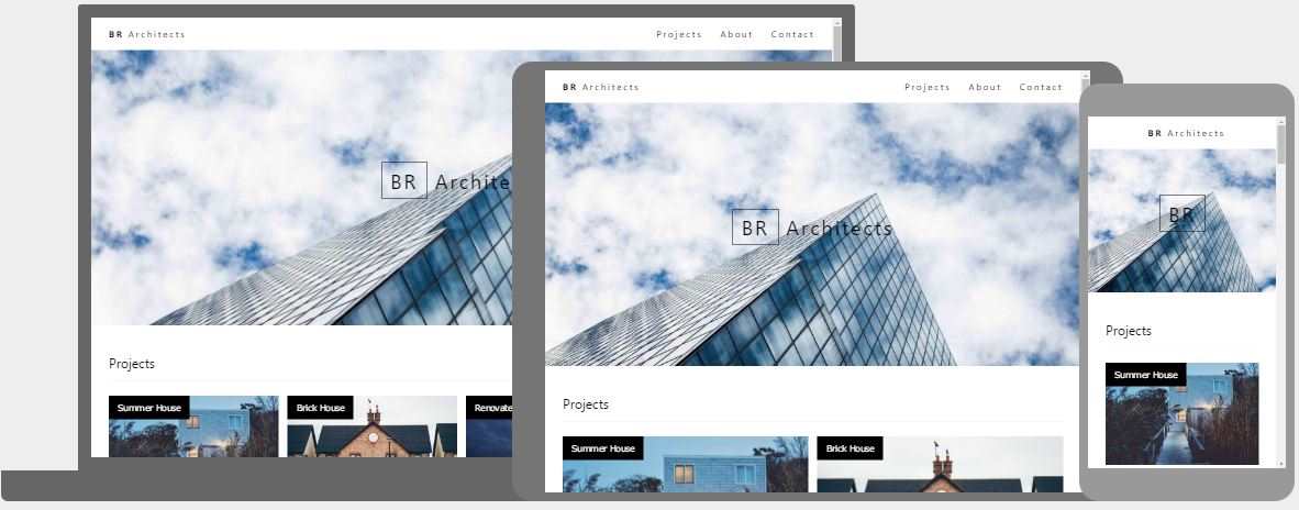
Architect Template
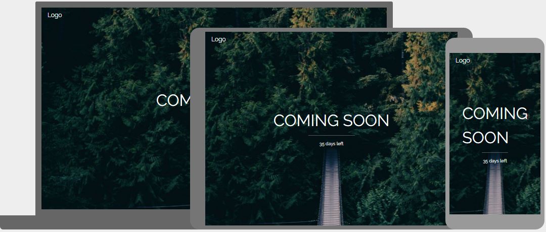
Coming Soon Template
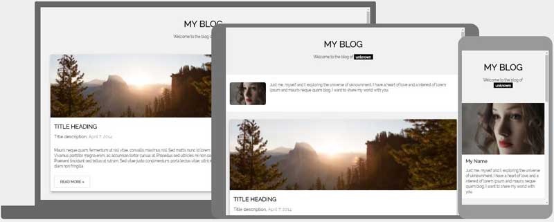
Blog Template
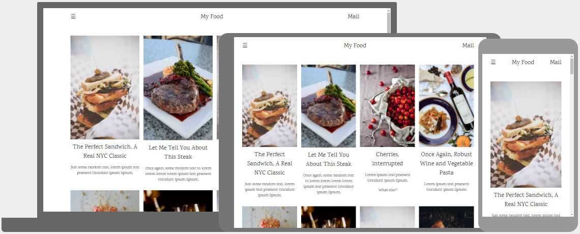
Food Blog Template
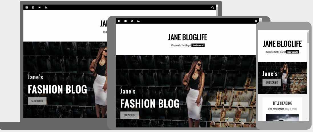
Fashion Blog Template
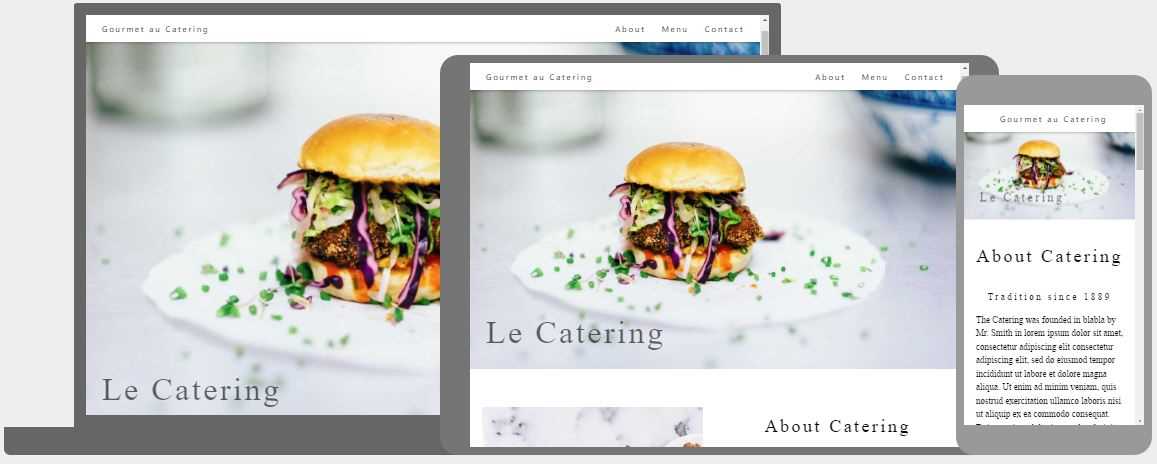
Gourmet Catering Template
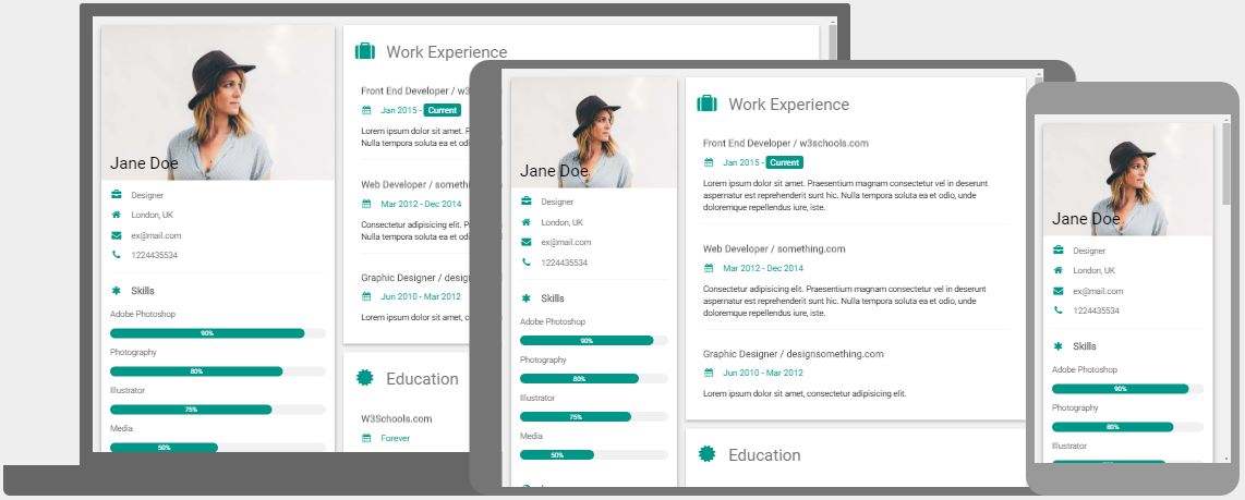
CV Template
Wedding Invitation Template
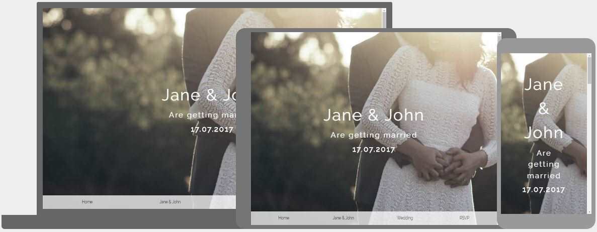
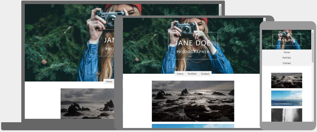
Photo Template

Black & White Photo Template
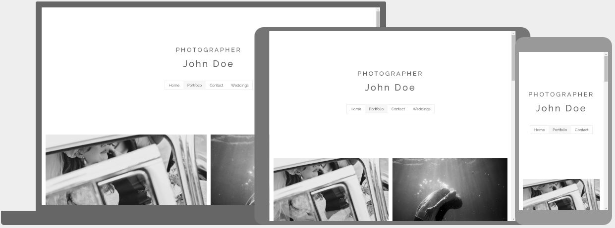
Photo III Template
Nature Portfolio Template
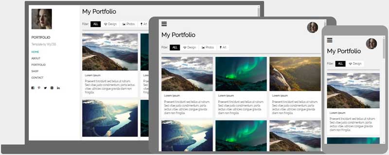
People Portfolio Template
People Portfolio II Template
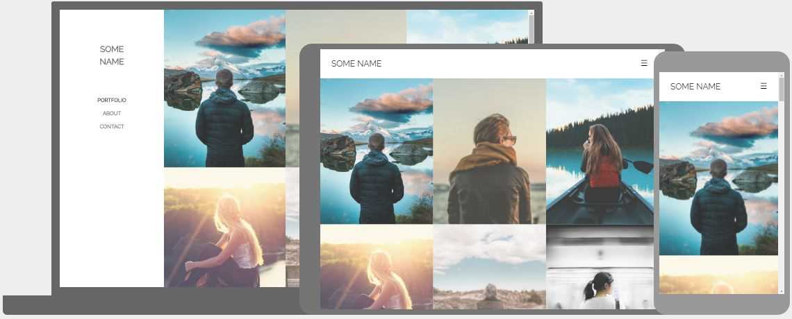
Dark Portfolio Template
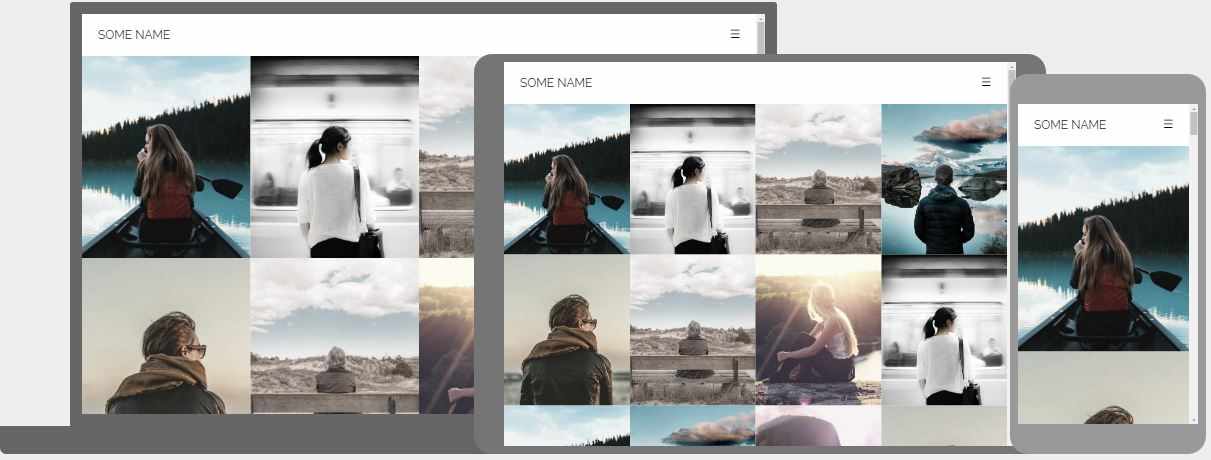
Black & White Portfolio Template
Parallax Template
Clothing Store Template
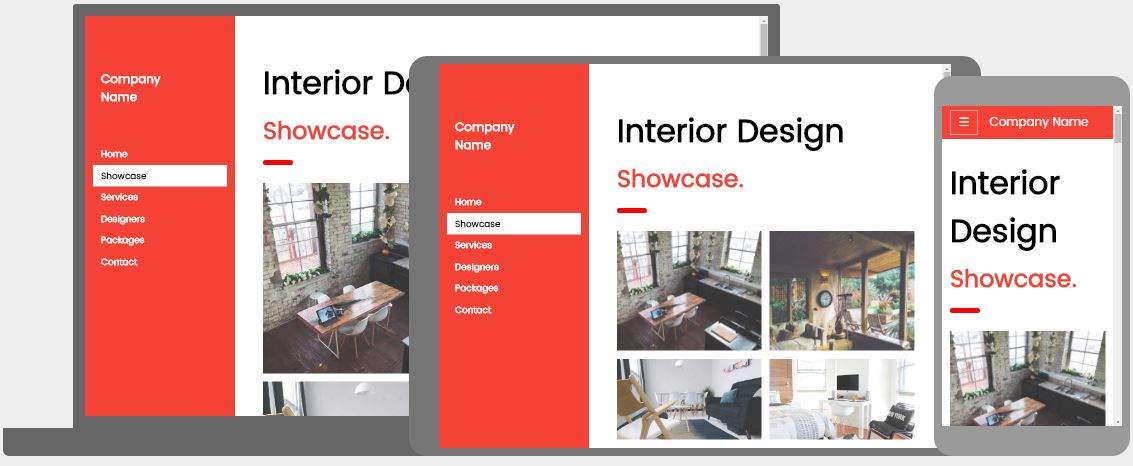
Interior Design Template
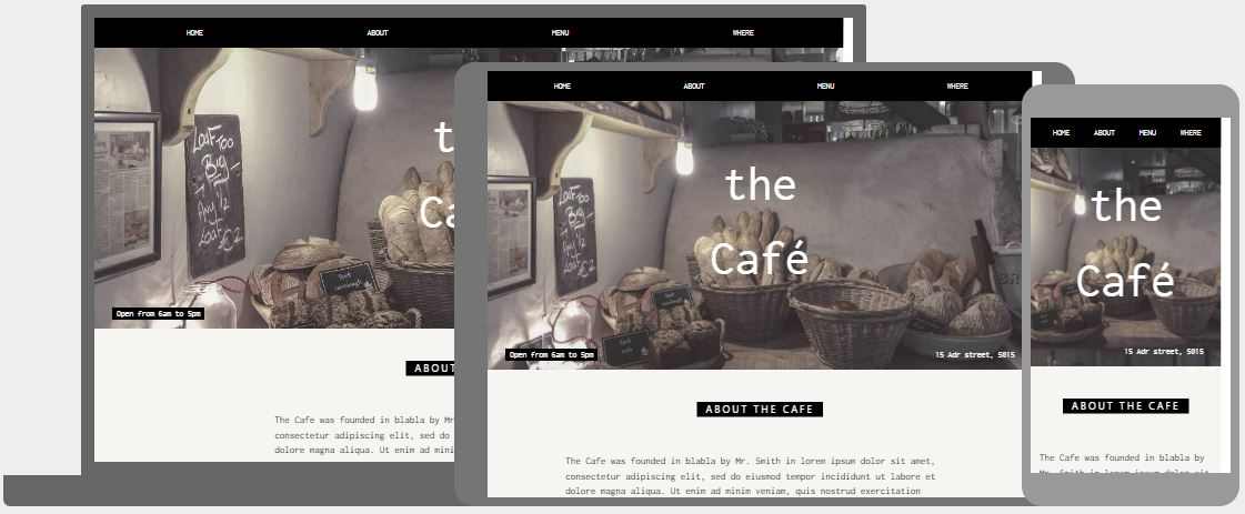
Cafe Template
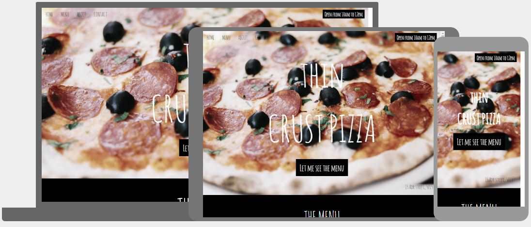
Pizza Restaurant Template
Modal Restaurant Template
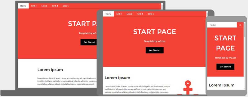
Start Page Template
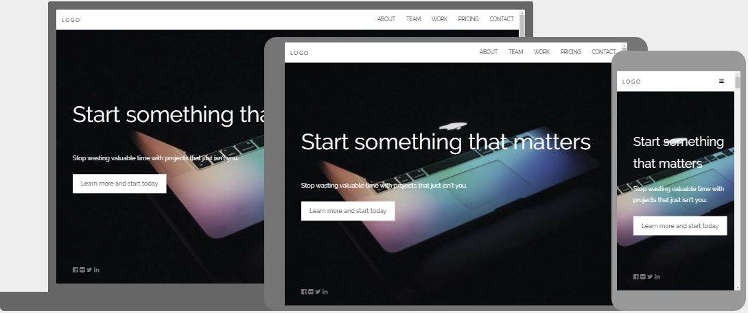
Startup Template
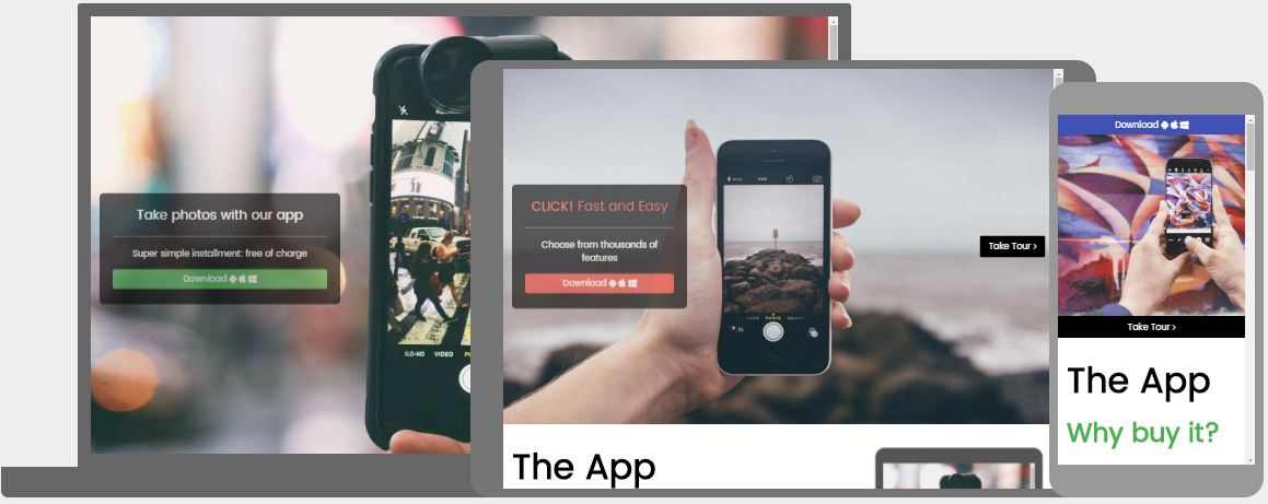
App Launch Template
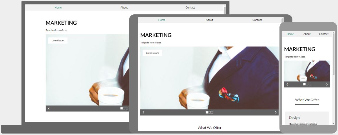
Marketing Template
Marketing / Website Template
Web Page Template
Social Media Template
Analytics Template
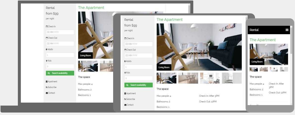
Apartment Rental Template
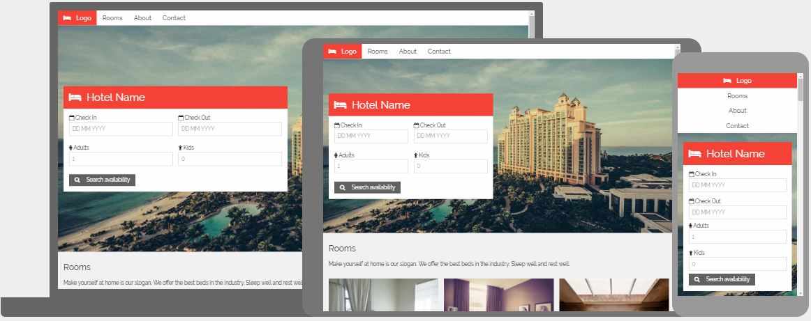
Hotel Template
Travel Template
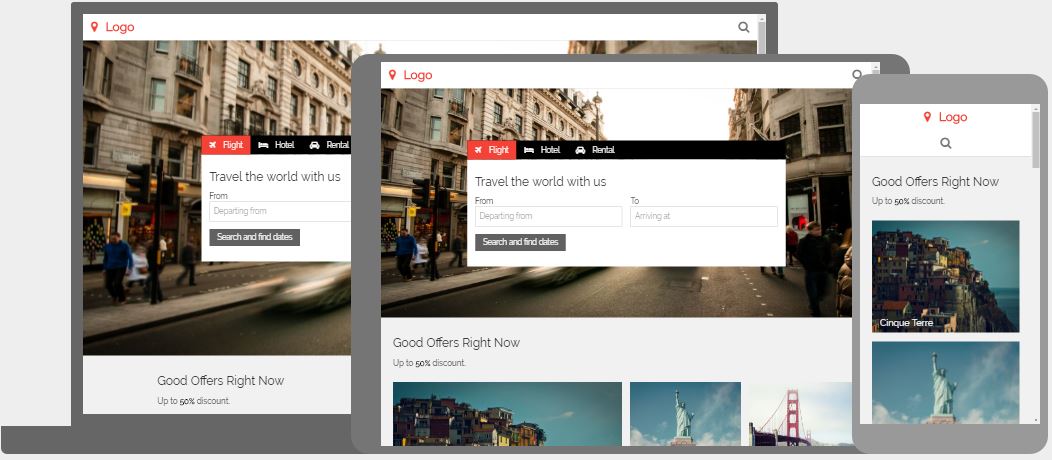
Travel Agency Template
House Design Template
Screen 50/50 Template
Mail Template
Kitchen Sink/Demo Template
