
 CSS Grid Layout Module
Header
Menu
Main
Right
Footer
Grid Layout
The CSS Grid Layout Module offers a grid-based layout system, with rows and columns, making it easier to design web pages without having to use floats and positioning.Browser Support
The grid properties are supported in all modern browsers.| 57.0 | 16.0 | 52.0 | 10 | 44 |
Grid Elements
A grid layout consists of a parent element, with one or more child elements.Example
<div class="grid-container">
<div class="grid-item">1</div>
<div class="grid-item">2</div>
<div class="grid-item">3</div>
<div class="grid-item">4</div>
<div class="grid-item">5</div>
<div class="grid-item">6</div>
<div class="grid-item">7</div>
<div class="grid-item">8</div>
<div class="grid-item">9</div>
</div> 1
2
3
4
5
6
7
8
9
Display Property
An HTML elemement becomes a grid container by setting thedisplay property to grid or inline-grid.Example
.grid-container {
display: grid;} Example
.grid-container {
display: inline-grid;} All direct children of the grid container automatically becomes grid items.Grid Columns
The vertical line of grid items are called columns.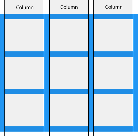
Grid Rows
The horizontal line of grid items are called rows.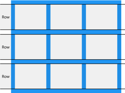
Grid Gaps
The space between each column/row are called gaps.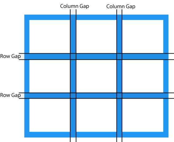 You can adjust the gap size by using one of theses properties:
grip-column-gapgrip-row-gapgrip-gapExample
The grid-column-gap property sets the gap between the columns: .grid-container {
display: grid;
grid-column-gap: 50px;} Example
The grid-row-gap property sets the gap between the rows: .grid-container {
display: grid;
grid-row-gap: 50px;} Example
The grid-gap property is a shorthand property for the grid-column-gap and the grid-row-gap properties: .grid-container {
display: grid;
grid-gap: 50px 100px;} Example
The grid-gap property can also be used to set both the column gap and the row gap in one value: .grid-container {
display: grid;
grid-gap: 50px;} Grid Lines
The line between columns are called column lines.The line between rows are called row lines.
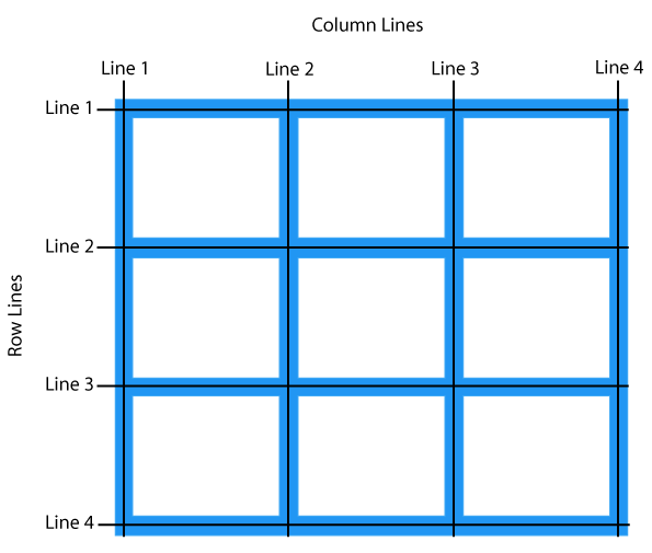 Refer to line numbers when placing a grid item in a grid container:
Example
Place a grid item at column line 1, and let it end on column line 3: .item1 {
grid-column-start: 1;
grid-column-end: 3;} Example
Place a grid item at row line 1, and let it end on row line 3: .item1 {
grid-row-start: 1;
grid-row-end: 3;} CSS Grid Container
1
2
3
4
5
6
7
8
Grid Container
To make an HTML element behave as a grid container, you have to set the display property to grid or inline-grid.Grid containers consist of grid items, placed inside columns and rows.
The grid-template-columns Property
Thegrid-template-columns property defines the number of columns in your grid layout, and it can define the width of each column.The value is a space-separated-list, where each value defines the the length of the respective column.
If you want your grid layout to contain 4 columns, specify the width of the 4 columns, or "auto" if all columns should have the same width.
Example
Make a grid with 4 columns: .grid-container {
display: grid;
grid-template-columns: auto auto auto auto;} Note: If you have more than 4 items in a 4 columns grid, the grid will automatically add a new row to put the items in.
The grid-template-columns property can also be used to specify the size (width) of the columns.Example
Set a size for the 4 columns: .grid-container {
display: grid;
grid-template-columns: 80px 200px auto 40px;} The grid-template-rows Property
Thegrid-template-rows property defines the height of each row.1
2
3
4
5
6
7
8
Example
.grid-container {
display: grid;
grid-template-rows: 80px 200px;} The justify-content Property
Thejustify-content property is used to align the whole grid inside the container.1
2
3
4
5
6
Note: The grid's total width has to be less than the container's width for the justify-content property to have any effect.
Example
.grid-container {
display: grid;
justify-content: space-evenly;} Example
.grid-container {
display: grid;
justify-content: space-around;} Example
.grid-container {
display: grid;
justify-content: space-between;} Example
.grid-container {
display: grid;
justify-content: center;} Example
.grid-container {
display: grid;
justify-content: start;} Example
.grid-container {
display: grid;
justify-content: end;} The align-content Property
Thealign-content property is used to vertically align the whole grid inside the container.1
2
3
4
5
6
Note: The grid's total height has to be less than the container's height for the align-content property to have any effect.
Example
.grid-container {
display: grid;
height: 400px;
align-content: center;} Example
.grid-container {
display: grid;
height: 400px;
align-content: space-evenly;} Example
.grid-container {
display: grid;
height: 400px;
align-content: space-around;} Example
.grid-container {
display: grid;
height: 400px;
align-content: space-between;} Example
.grid-container {
display: grid;
height: 400px;
align-content: start;} Example
.grid-container {
display: grid;
height: 400px;
align-content: end;} CSS Grid Item
1
2
3
4
5
Child Elements (Items)
A grid container contains grid items.By default, a container has one grid item for each column, in each row, but you can style the grid items so that they will span multiple columns and/or rows.
The grid-column Property:
Thegrid-column property defines on which column(s) to place an item.You define where the item will start, and where the item will end.
1
2
3
4
5
6
7
8
9
10
11
12
13
14
15
Note: The grid-column property is a shorthand property for the grid-column-start and the grid-column-end properties.
To place an item, you can refer to line numbers, or use the keyword "span" to define how many columns the item will span.Example
Make "item1" start on line 1 and end on line 5: .item1 {
grid-column: 1 / 5;} Example
Make "item1" start on column 1 and span 3 columns: .item1 {
grid-column: 1 / span 3;} Example
Make "item2" start on column 2 and span 3 columns: .item2 {
grid-column: 2 / span 3;} The grid-row Property:
Thegrid-row property defines on which row to place an item.You define where the item will start, and where the item will end.
1
2
3
4
5
6
7
8
9
10
11
12
13
14
15
16
Note: The grid-row property is a shorthand property for the grid-row-start and the grid-row-end properties.
To place an item, you can refer to line numbers, or use the keyword "span" to define how many rows the item will span:Example
Make "item1" start on row-line 1 and end on row-line 4: .item1 {
grid-row: 1 / 4;} Example
Make "item1" start on row 1 and span 2 rows: .item1 {
grid-row: 1 / span 2;} The grid-area Property
Thegrid-area property can be used as a shorthand property for the grid-row-start, grid-column-start, grid-row-end and the grid-column-end properties.1
2
3
4
5
6
7
8
9
10
11
12
13
14
15
Example
Make "item8" start on row-line 1 and column-line 2, and end on row-line 5 and column line 6: .item1 {
grid-area: 1 / 2 / 5 / 6;} Example
Make "item8" start on row-line 2 and column-line 1, and span 2 rows and 3 columns: .item1 {
grid-area: 2 / 1 / span 2 / span 3;} Naming Grid Items
Thegrid-area property can also be used to assign names to grid items.Header
Menu
Main
Right
Footer
grid-template-areas property of the grid container.Example
Item1 gets the name "myArea" and spans all five columns in a five columns grid layout: .item1 {
grid-area: myArea;}
.grid-container {
grid-template-areas: 'myArea myArea myArea myArea myArea';}
The columns in each row is defined inside the apostrophes, separated by a space.
Note: A period sign represents a grid item with no name.
Example
Let "myArea" span two columns in a five columns grid layout (period signs represent items with no name): .item1 {
grid-area: myArea;}
.grid-container {
grid-template-areas: 'myArea myArea . . .';}
Example
Make "item1" span two columns and two rows: .grid-container {
grid-template-areas: 'myArea myArea . . .' 'myArea myArea . . .';}
Example
Name all items, and make a ready-to-use webpage template: .item1 { grid-area: header; }
.item2 { grid-area: menu; }
.item3 { grid-area: main; }
.item4 { grid-area: right; }
.item5 { grid-area: footer; }
.grid-container {
grid-template-areas:
'header header header header header header'
'menu main main main right right'
'menu footer footer footer footer footer';}
The Order of the Items
The Grid Layout allows us to position the items anywhere we like.The first item in the HTML code does not have to appear as the first item in the grid.
1
2
3
4
5
6
Example
.item1 { grid-area: 1 / 3 / 2 / 4; }
.item2 { grid-area: 2 / 3 / 3 / 4; }
.item3 { grid-area: 1 / 1 / 2 / 2; }
.item4 { grid-area: 1 / 2 / 2 / 3; }
.item5 { grid-area: 2 / 1 / 3 / 2; }
.item6 { grid-area: 2 / 2 / 3 / 3; } Example
@media only screen and (max-width: 500px) {
.item1 { grid-area: 1 / span 3 / 2 / 4; }
.item2 { grid-area: 3 / 3 / 3 / 4; }
.item3 { grid-area: 2 / 1 / 2 / 2; }
.item4 { grid-area: 2 / 2 / span 2 / 3; }
.item5 { grid-area: 3 / 1 / 3 / 2; }
.item6 { grid-area: 2 / 3 / 2 / 4; }} 
